Conversion-Focused Website Design: Structure Service Pages That Earn Trust and Drive Enquiries
Learn how conversion-focused website design turns traffic into qualified service leads with clear layouts, strategic trust signals, and frictionless CTAs.
By Growth Kings. Published , updated . 16 min read.

Conversion-Focused Website Design: Structure Service Pages That Earn Trust and Drive Enquiries
If your service business attracts steady web traffic but struggles to generate qualified phone calls or contact form submissions, the issue is rarely a lack of interest. More often, it is a structural failure. Most traditional web design focuses almost entirely on visual polished aesthetics, branding colors, and trendy animations. However, conversion-focused website design approaches your digital presence as a commercial sales tool engineered to systematically turn casual visitors into high-intent leads.
When potential clients visit a service web page, they are looking for specific answers: Can this company solve my exact problem? Do I trust them to deliver? What happens if I get in touch? If your page layout obscures those answers behind vague corporate copy and buried contact forms, prospective buyers leave.
In this comprehensive guide, we will walk through how to structure high-converting service pages, position strategic trust signals, streamline user pathways, and optimize your existing site assets without burning budget on an unnecessary total rebuild.
Key Takeaways
| Core Focus Area | Traditional Web Design | Conversion-Focused Web Design |
|---|---|---|
| Primary Goal | Visual beauty, brand prestige, and aesthetic trends | Commercial inquiry generation and qualified lead intake |
| Hero Section | Vague taglines, generic stock imagery, hidden CTAs | Precise value proposition, clear offer, and immediate trust badges |
| Trust Elements | Isolated "Testimonials" page or generic bottom slider | Contextual social proof placed adjacent to key conversion points |
| User Pathway | Multi-page exploratory maze with high cognitive load | Logical problem-solution flow with transparent next steps |
| Optimization Approach | Costly ground-up redesigns every 3 to 4 years | Data-driven, incremental layout refactoring based on user behavior |
What Is Conversion-Focused Website Design for Service Businesses?
For service providers—whether you run a commercial law firm, an industrial engineering consultancy, a high-end contracting business, or a specialized agency—website visitors behave very differently from e-commerce shoppers. There is no instant "Add to Cart" impulse buying. Buying a professional service carries inherent risk, requiring a higher level of confidence before a prospective customer will share their contact details or schedule a consultation.
Conversion-focused website design is the discipline of structuring web layouts, messaging visual hierarchy, and interactive touchpoints to minimize user hesitation and maximize high-intent lead generation.
Shifting from Visual Aesthetics to Commercial Functionality
A visually stunning website that fails to convert traffic is simply an expensive digital brochure. While clean aesthetic standards matter, research from the Stanford Web Credibility Project shows that 75% of users admit to making judgments about a company's credibility based on their website design. Credibility, however, is built on clarity and structural professional presentation—not unnecessary flash.
Traditional designers often design for approval in a boardroom. They build layouts featuring full-screen looping background videos, slow parallax scrolling, and abstract marketing slogans ("Transforming Tomorrow Today"). In contrast, a service website design that converts prioritizes functional speed, immediate clarity, and frictionless navigation.
The Operational Difference Between Traffic Generation and Conversion
Many business owners believe their primary online problem is traffic. They invest heavily in search engine optimization (SEO) or pay-per-click (PPC) advertising to drive prospective clients to their pages. Yet, bringing traffic to an unoptimized layout is like pouring water into a leaky bucket.
If your service page converts at 1%, doubling your traffic doubles your leads—at twice the marketing spend. But if you refine your site's information architecture and double your conversion rate to 2%, you double your leads instantly without spending an extra dollar on media buying. To understand where your current funnel is losing revenue, using a Conversion Rate Calculator can help you quantify hidden traffic leaks and calculate potential lead gains.
The Three Pillars of High-Converting Pages: Clarity, Trust, and Friction Reduction
High-converting service pages rely on three core principles working simultaneously:
- Clarity: Visitors must comprehend what you do, who you serve, and how you deliver within seconds of landing on your page.
- Trust: Proof of your competence, past successful outcomes, and client satisfaction must be woven directly into the content layout.
- Friction Reduction: Every barrier between reading a value proposition and submitting an inquiry—such as overly complex forms or unclear booking processes—must be eliminated.
       +-------------------------------------------------------+
       |           HIGH-CONVERTING SERVICE PAGE                |
       +-------------------------------------------------------+
                                   |
         +-------------------------+-------------------------+
         |                         |                         |
         v                         v                         v
  +--------------+          +--------------+          +--------------+
  |   CLARITY    |          |    TRUST     |          |  FRICTION    |
  |              |          |              |          |  REDUCTION   |
  | Clear Offer  |          | Social Proof |          | Simple Forms |
  | Target Audience|        | Accreditations|         | Instant CTAs |
  | Plain English|          | Case Metrics |          | Fast Loading |
  +--------------+          +--------------+          +--------------+
How Do You Structure a Conversion-Focused Website Design Layout for Services?
Structuring high converting service pages requires taking prospective buyers through a logical, psychological sequence. You are answering their implicit questions in the exact order they naturally ask them.
The Above-the-Fold Framework: Clear Value Proposition and Primary CTA
The top portion of your page—the area visible before a user begins scrolling—is the most valuable digital real estate on your domain. Usability research by the Nielsen Norman Group shows that users typically stay on a web page for less than 10 to 20 seconds unless a clear value proposition catches their attention above the fold.
To capture that attention immediately, your hero section should feature four essential components:
- A Clear Headline: State precisely what service you provide and the primary outcome you deliver to your clients. Avoid poetic slogans.
- A Supporting Subheadline: Specify who you help, how you do it, or the core differentiator that sets your service firm apart.
- Immediate Trust Signals: Display recognizable client logos, review ratings, or certification badges directly beneath your primary text.
- A Primary Call-to-Action (CTA): A prominent, contrasting button directing the user to take the next single step (e.g., "Request a Consultation," "Get an Instant Quote").
+-----------------------------------------------------------------------+
|  [Logo]                                          [Phone: 1-800-XXX-XXXX] |
|                                                                       |
|  HEADLINE: Commercial HVAC Maintenance That Prevents System Downtime  |
|                                                                       |
|  Subheadline: We help enterprise facility managers maintain 99.9%     |
|  uptime with guaranteed 2-hour emergency response times across Dallas. |
|                                                                       |
|  [ Request a Free Facility Audit ]   <-- Primary Action Button         |
|                                                                       |
|  [ Trust Badges: ISO 9001 Certified | 4.9/5 Stars on Google (120+ Reviews)]|
+-----------------------------------------------------------------------+
Problem-Solution Mapping: Articulating Pain Points Before Pitching Services
Once visitors scroll past the hero banner, avoid diving straight into a list of technical features. Prospective clients don't buy service features; they buy solutions to their active pain points.
Effective website clarity and trust design requires problem-solution mapping. Dedicate your first body section to describing the exact frustrations, financial risks, or operational inefficiencies your clients face. When visitors see their current situation described accurately on your page, their subconscious immediate reaction is: "These people truly understand my problem."
Only after establishing this mutual understanding should you introduce your service framework as the direct, reliable solution. For a deeper breakdown of structural section order, review our detailed guide on services web page design.
Process Transparency: Demystifying What Happens Next to Reduce Hesitation
One of the largest hidden conversion killers on service websites is ambiguity. When a prospective client fills out a contact form, they often wonder: Will I get spammed? Will a aggressive salesperson call me instantly? How long will I wait for a quote?
You can eliminate this hesitation by incorporating a clear, 3-step process section on your service pages:
- Step 1: Initial Discovery Call (15 Mins) — We review your project goals and assess technical requirements.
- Step 2: Tailored Proposal & Roadmap — You receive a detailed scope of work with transparent fixed pricing.
- Step 3: Seamless Execution — Our specialist team initiates project onboarding within 48 hours.
Outlining a simple, predictable sequence dramatically lowers the perceived risk of taking action.

How Can Trust Signals Be Strategically Integrated Across Your Layout?
Trust is not something you claim; it is something you prove. Simply writing "We offer industry-leading service quality" does not build confidence. Your website layout must weave hard proof directly into the reading experience.
Contextual Social Proof: Placing Testimonials Near Key Action Points
Most traditional service websites relegate client feedback to a standalone "Testimonials" page or an auto-rotating slider buried at the bottom of the homepage. Slider carousels are notorious conversion bottlenecks because users rarely sit and wait for slides to auto-rotate, and critical social proof gets completely missed.
Instead, utilize contextual social proof. This means placing specific, outcome-driven client quotes directly alongside relevant section topics and lead capture points.
- Bad Placement: A generic quote stating "Great company to work with!" inside an auto-playing footer slider.
- Good Placement: A concrete quote stating "They cut our onboarding time in half within 30 days" positioned directly next to your service feature bullet points or right above your contact form field.
Establishing Authority Through Proof Elements Beyond Client Quotes
While testimonials are valuable, established service firms should leverage multiple forms of objective authority across their conversion focused layout for services:
- Quantitative Outcome Metrics: Highlighting concrete achievements (e.g., "$14M+ Revenue Generated for Clients," "99.4% On-Time Project Delivery Rate").
- Verified Accreditations & Badges: Industry compliance certifications, professional trade association badges, or official software partner credentials.
- Mini Case Study Highlights: Brief summary cards featuring the client's initial challenge, the strategic intervention applied, and the measured real-world outcome.
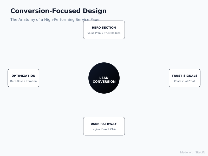
Infographic by SiteLift
Micro-Copy and Risk Reversal: Addressing Common Objections at Conversion Points
The small snippets of text positioned near your buttons and form input boxes are called micro-copy. Strategic micro-copy acts as a real-time objection handler at the exact moment a prospective buyer decides whether to submit their information.
+-------------------------------------------------------------+
|                     SCHEDULE A CONSULTATION                 |
|                                                             |
|  [ Name Input ]             [ Email Input ]                 |
|                                                             |
|  [ Phone Number ]           [ Project Scope Dropdown ]      |
|                                                             |
|  [ Submit Inquiry Button ]                                  |
|                                                             |
|  Micro-copy:                                                |
|  🔒 100% Privacy Guaranteed. No spam.                       |
|  ⚡ Typical response time: Under 2 business hours.           |
|  📋 No obligation or credit card required.                  |
+-------------------------------------------------------------+
Pro Tip: Never leave a lead form floating in isolation. Always surround your inquiry form with micro-copy guarantees—such as response speed assurances or non-disclosure commitments—to minimize submission anxiety.
What Visual Hierarchy and Interactive Elements Drive Visitor Action?
Visual hierarchy dictates the order in which a human eye scans information on a screen. If your layout features equal visual emphasis on every element, nothing stands out, causing cognitive overload.
Guiding Eye Movement Using White Space, Directional Cues, and Contrast
High-converting service layouts use generous white space (padding around elements) to isolate important concepts and reduce visual clutter.
- Contrast: Primary elements—especially your Call-to-Action buttons—must use high-contrast colors that distinctly pop against the background palette.
- Directional Cues: Visual elements like subtle arrows, facial focal points in images pointing toward headline copy, or structural lines naturally guide the reader's gaze toward high-priority conversion points.
- Typography Scale: Bold, readable headers paired with comfortable body copy font sizes (at least 16px to 18px) prevent reader fatigue on mobile devices.
Designing Action-Oriented Call-to-Actions (CTAs) That Stand Out
Generic CTA buttons like "Submit," "Learn More," or "Click Here" perform poorly because they fail to communicate value or outcome. Research published by HubSpot reveals that personalized and context-specific call-to-action buttons perform 202% better than generic default CTAs.
To elevate button conversions, reframe generic commands into action-oriented benefit statements:
| Generic CTA (Low Performing) | Action-Oriented CTA (High Converting) |
|---|---|
| Submit | Request Your Custom Audit |
| Contact Us | Talk to a Senior Specialist |
| Learn More | View Case Studies & Pricing |
| Send Message | Book a 15-Min Strategy Session |
Furthermore, ensure your main call-to-action appears consistently across the page layout: once above the fold, mid-page after explaining your value proposition, and a final prominent placement at the page footer.
Integrating Instant Conversational Tools for After-Hours Inquiries
Modern buyers expect rapid responses. If a decision-maker researches your services outside standard office hours, expecting them to wait 24 to 48 hours for an email response often leads to lost deals. They will simply jump back to Google search results and contact a competitor who responds faster.
Integrating modern conversational tools—such as AI-driven lead capture assistants—allows service firms to qualify leads and answer basic scope questions 24/7. To explore how automated triage tools improve capture rates without annoying website visitors, check out our insights on AI conversion optimization.
How Do You Audit and Optimize an Existing Page Without a Full Rebuild?
Many business leaders believe that improving website performance requires burning six months and tens of thousands of dollars on a complete site redesign. In reality, total redesigns frequently cause SEO disruptions and destroy existing conversion pathways.
Instead of starting from scratch, implementing a structured framework for auditing and refactoring existing pages yields faster, more measurable growth. If you want to understand the complete framework behind this methodology, review our guide covering the steps of conversion optimization.
Identifying Bottlenecks with Heatmaps and User Session Analysis
Before modifying layout elements, analyze how users currently interact with your pages:
- Click Heatmaps: Reveal whether visitors click non-clickable design elements or ignore primary CTA buttons.
- Scroll Maps: Show precisely where the majority of visitors stop scrolling and drop off your page.
- Session Recordings: Highlight usability friction, such as users struggling with complex form fields or missing key trust elements.
In addition to visual tracking, audit technical performance. Page speed research published on Think with Google indicates that as page load time goes from 1 second to 3 seconds, the probability of a user bouncing increases by 32%. A slow page destroys conversion rates before visitors even read your hero headline.
Executing Incremental Page Layout Tweaks for Maximum Conversion Impact
Rather than changing everything simultaneously, execute high-impact incremental improvements:
- Sharpen the Hero Headline: Rewrite abstract taglines into explicit value statements.
- Position Trust Signals Higher: Move client logos and review badges above the scroll fold.
- Trim Lead Capture Forms: Eliminate non-essential form fields (e.g., remove fax numbers, physical addresses, or drop-down fields that create friction).
- Fix Button Contrast & Copy: Transform passive text into action-oriented buttons.
       +-------------------------------------------------------+
       |             INCREMENTAL OPTIMIZATION                  |
       +-------------------------------------------------------+
                                   |
         +-------------------------+-------------------------+
         |                         |                         |
         v                         v                         v
  +--------------+          +--------------+          +--------------+
  |  STEP 1:     |          |  STEP 2:     |          |  STEP 3:     |
  | Audit & Map  | -------> | Refactor Copy| -------> | Reduce Form  |
  |  (Heatmaps)  |          | & Trust CTAs |          |  Friction    |
  +--------------+          +--------------+          +--------------+
Measuring Lead Quality alongside Raw Conversion Rate Metrics
Optimization is not merely about increasing raw inquiry quantity; it is about driving qualified business opportunities. If a layout change doubles your form submissions but fills your sales team's inbox with low-budget, mismatched leads, the optimization failed.
Track key performance indicators (KPIs) such as cost-per-qualified-lead (CPQL), sales discovery call booking rates, and ultimate customer acquisition cost (CAC). Professional conversion optimisation services focus on aligning website layout structures directly with revenue outcomes rather than vanity traffic numbers.
My Editorial Take: Why "Refactoring" Beats Full Rebuilds Every Single Time
I see established service businesses fall into the exact same expensive trap every three years.
They feel their website isn't bringing in enough leads, so they hire a traditional web design agency. The agency convinces them to scrap their entire website, pay for a costly ground-up rebuild, and wait four to six months for launch. When the new site finally goes live, it looks slick and modern—but lead volume stays flat, or worse, drops because organic rankings collapsed during the migration.
Here is my honest perspective: Full website rebuilds are usually an expensive distraction for established service firms.
When your site isn't generating qualified inquiries, the solution is rarely to throw away your domain authority, existing content indexation, and brand equity. The solution is to refactor your conversion layout.
+-------------------------------------------------------------------------+
|                  THE SERVICE SITE REDESIGN TRAP                         |
+-------------------------------------------------------------------------+
|  Traditional Redesign Route:                                            |
|  💸 High Expense ($15k–$50k+) -> ⏳ 6 Months Delay -> ⚠️ Lost SEO Rank  |
|                                                                         |
|  Conversion Refactoring Route:                                          |
|  🎯 Target Layout Fixes -> ⚡ Launch in Days -> 📈 Immediate Lead Lift  |
+-------------------------------------------------------------------------+
Refactoring means analyzing your existing high-traffic service pages, fixing confusing headlines, rearranging section flows to follow natural decision-making psychology, strengthening trust signals, and making CTAs irresistible. You retain your existing traffic while turning significantly more of those visitors into revenue-generating conversations.
Stop starting from scratch. Fix the structural leaks in the pages you already have.
Turn Your Service Pages Into High-Performing Revenue Drivers
If your established service business has steady traffic but your lead pipeline isn't reflecting it, you don't need a cosmetic overhaul—you need strategic clarity and friction reduction.
At growth-kings.com, we help service businesses optimize their digital assets to convert visitors into high-intent sales conversations. We specialize in precision conversion refactoring, user experience optimization, and deploying 24/7 intelligent lead-triage systems that capture after-hours opportunities.
Rather than forcing you into a costly, months-long site rebuild, we identify and repair the specific leaks in your current funnel to deliver rapid, measurable growth in qualified inquiries.
Frequently Asked Questions About Service Page Conversion Design
What is the difference between traditional web design and conversion-focused web design?
Traditional web design focuses primarily on aesthetic appearance, visual trends, and brand creative expression. Conversion-focused website design prioritizes commercial functionality, user experience architecture, messaging clarity, and strategic trust placement to guide visitors into taking specific action, such as submitting a form or scheduling a call.
What key elements must be included above the fold on a service page?
An effective above-the-fold hero section must include a clear, benefit-focused headline, a supporting subheadline clarifying who you serve, an action-oriented primary Call-to-Action (CTA) button, and immediate trust indicators such as client review ratings or industry certifications.
How many call-to-action (CTA) buttons should a service page have?
A high-converting service page should focus on one primary goal (e.g., booking a consultation). However, that primary CTA button should appear multiple times across the layout as the user scrolls—typically above the fold, midway through the page following the process breakdown, and at the bottom of the page.
How does page loading speed affect website conversion rates?
Page speed directly impacts bounce rates and lead generation. Research from Google indicates that as page load times move from 1 to 3 seconds, the probability of a user bouncing increases by 32%. Slow loading speeds frustrate users and reduce trust before they even read your headline.
Do established service businesses need a complete website redesign to improve conversion rates?
No. In most cases, established service businesses do not need a costly, ground-up website redesign. Conversion rates can be significantly improved by refactoring existing high-traffic pages—sharpening value propositions, improving button contrast, trimming unnecessary form fields, and strategically repositioning social proof.
— growth-kings.com
Want this working on your own site?
Tell us what’s working, what’s stuck and what you want to improve. We will reply personally.