Services Web Page Design That Books Jobs: Structure, Trust and CTAs That Convert
Master services web page design that books jobs. Learn high-converting layout structures, strategic trust signals, and CTA optimization tactics.
By Growth Kings. Published , updated . 17 min read.

Services Web Page Design That Books Jobs: Structure, Trust and CTAs That Convert
If your service business relies on its website to generate revenue, your service pages carry the heaviest commercial burden on your entire domain. Yet, most services web page design projects treat these critical assets like passive brochures rather than active sales machines. Visitors arrive wanting to know whether you can solve their exact problem, how much friction is involved, and whether they can trust you with their hard-earned money. When your page hides those answers behind generic jargon and decorative design, prospects quietly bounce to a competitor.
Building a page that consistently books jobs requires understanding buyer psychology, structural clarity, and decision architecture.
Key Takeaways: High-Converting Service Page Blueprint
| Page Component | Traditional (Low-Converting) Approach | High-Converting Architecture | Expected Impact |
|---|---|---|---|
| Hero Section | Vague slogan, stock photos, generic "Contact Us" | Specific outcome headline, target audience, primary action | Immediate drop in initial bounce rate |
| Value Proposition | List of internal tasks and tools | Solutions mapped to client pain points and business outcomes | Higher time-on-page and engagement |
| Process Section | Missing or overly technical operational manual | Simple 3-step "How It Works" framework | Reduced cognitive load and purchase anxiety |
| Social Proof | Isolated testimonial carousel at bottom of page | Contextual testimonials and proof points near friction areas | Increased conversion on booking forms |
| Call to Action | "Submit" or "Send Message" at page bottom | Benefit-driven microcopy and tiered action steps | Higher click-to-inquiry rate |
| Lead Capture | 10-field static web forms | Low-friction forms backed by real-time conversational triage | Capture of after-hours and mobile demand |
Why Does Most Services Web Page Design Fail to Generate Qualified Leads?
Most service companies do not suffer from a lack of skill in their trade; they suffer from a communication breakdown on the screen. When a business invests thousands of dollars into website redesigns, the conversation almost always revolves around brand colours, stylish fonts, and clever animations.
While visual professionalism matters, aesthetic polish alone does not persuade a skeptical prospect to book a consultation. Effective service page design for service businesses must function as an automated sales enablement tool that guides visitors through an intentional decision-making sequence.
The Aesthetic Trap: Prioritizing Visual Fluff Over Decision Architecture
Web designers frequently design for design awards rather than commercial conversion. They incorporate heavy video backgrounds, parallax scrolling, and floating elements that look impressive in a portfolio review but distract the user from taking action.
When a prospect lands on your page, their brain is scanning for relevance, clarity, and safety. If your primary service offering is buried beneath animated transitions or hidden within expandable tabs, you force the user to work to understand what you do. Cognitive friction is the primary driver of bounce rates. If users have to decipher your layout, they will hit the back button and visit a competitor whose offering is instantly obvious.
The Clarity Gap: Failing the 5-Second Value Proposition Test
According to research by the Nielsen Norman Group on how long users stay on web pages, users often leave web pages within 10 to 20 seconds, meaning a clear value proposition must be communicated within the first 10 seconds to retain attention.
If an executive or homeowner cannot answer three simple questions within five seconds of landing on your service page, your layout has failed:
- What specific service do you deliver?
- Who is this service engineered for?
- What is the immediate next step to get started?
Most pages open with lofty taglines like "Empowering Innovative Solutions for Modern Growth." This language means nothing to a client facing an urgent operational problem or looking for a dependable specialist. Clear, literal explanations will outperform clever, abstract branding every single day.
[ Traditional Fluff Hero ]
"Innovative Solutions for Tomorrow's Leaders" ❌
(Confusing, vague, zero emotional resonance)

[ High-Converting Hero ]
"Commercial HVAC Maintenance That Cuts Emergency Downtime by 40%" ✅
(Clear service, specific target market, measurable business outcome)
Self-Centred Messaging vs. Client-Centric Problem Solving
The third fatal flaw in standard services web page design is self-absorbed copywriting. Traditional service pages read like corporate résumés: "We were founded in 2008, we pride ourselves on exceptional customer care, and our team uses cutting-edge methodologies."
Your client does not care about your internal history until they know you understand their pain. High-converting service pages invert this dynamic. They lead with the prospect’s current reality: the costly delays they are suffering, the compliance headaches they want resolved, or the unreliable contractors they are tired of managing. Once the prospect feels understood, they are ready to evaluate your solution.
What Is the High-Converting Services Web Page Design Layout That Books Jobs?
A conversion-focused service page layout that converts follows a logical narrative structure. It mirrors a successful direct sales conversation: hook attention, articulate the problem, present the solution, clarify the deliverables, provide proof, and ask for the sale.

Above the Fold: Hero Section Architecture That Secures Attention
The top screen of your service page is prime real estate. You cannot afford to waste it on unclickable stock photos or generic slogans. A high-converting hero section requires four tightly integrated components:
- A Clear, Direct H1 Headline: State exactly what you do and the core benefit you unlock. Avoid metaphors.
- A Grounded Sub-Headline: Add depth to the H1 by identifying who you serve, how your process works, and how you de-risk the engagement.
- A Primary Call to Action Button: A high-contrast button pointing to the single most important action (e.g., "Schedule Your Service Audit").
- An Immediate Trust Anchor: A row of client logos, star ratings, or verified accreditations placed directly below the CTA to reassure visitors before they scroll.
Pro Tip: Never use auto-rotating image sliders in your hero section. Usability tests consistently show that rotating carousels trigger banner blindness, irritate users by moving content while they read, and suppress conversion rates.
The Logical Flow: Structuring the Problem, Solution, and Delivery Process
Once the visitor scrolls past the hero section, you must guide their thinking step-by-step. The middle of the page should answer the silent doubts running through their head.
┌────────────────────────────────────────┐
│ 1. Hero Section (H1 + Sub + CTA + Proof)│
├────────────────────────────────────────┤
│ 2. The Problem (Pain points & costs)   │
├────────────────────────────────────────┤
│ 3. The Solution (Your mechanism/offer) │
├────────────────────────────────────────┤
│ 4. How It Works (Simple 3-step process)│
├────────────────────────────────────────┤
│ 5. Deliverables & Scope (Clarity)      │
├────────────────────────────────────────┤
│ 6. Contextual Social Proof             │
├────────────────────────────────────────┤
│ 7. Final Closing CTA & Risk Reversal   │
└────────────────────────────────────────┘
The most critical transition here is the "How It Works" framework. Service offerings often feel abstract. When a client hires an accountant, a software engineer, or a specialized restoration crew, they worry about hidden complications, unexpected timelines, and administrative chaos.
Break down your onboarding and delivery into three digestible steps:
- Step 1: The Initial Assessment (Discovery): How you audit or diagnose their situation.
- Step 2: The Tailored Execution (Implementation): How you carry out the work without disrupting their day-to-day operations.
- Step 3: The Desired Outcome (Resolution): What ongoing success, compliance, or relief looks like once the job is complete.
This straightforward framework reduces cognitive load and removes the fear of the unknown.
Scope and Deliverables: Demystifying What the Client Actually Receives
Vagueness kills inbound inquiries. When a prospective client finishes reading a service page and cannot visualize what happens after they sign on, they hesitate. That hesitation often leads them to postpone the decision indefinitely.
Structure your deliverables clearly using bulleted feature-benefit pairs. Rather than saying "Comprehensive Reporting," state "Monthly Executive Dashboards that highlight your exact cost savings and operational bottlenecks."
If you offer tiered service scopes or standardized packages, present them side-by-side. To explore how to package and price distinct service tiers without scaring away high-value clients, review our guide on designing a service pricing page that converts enquiries.
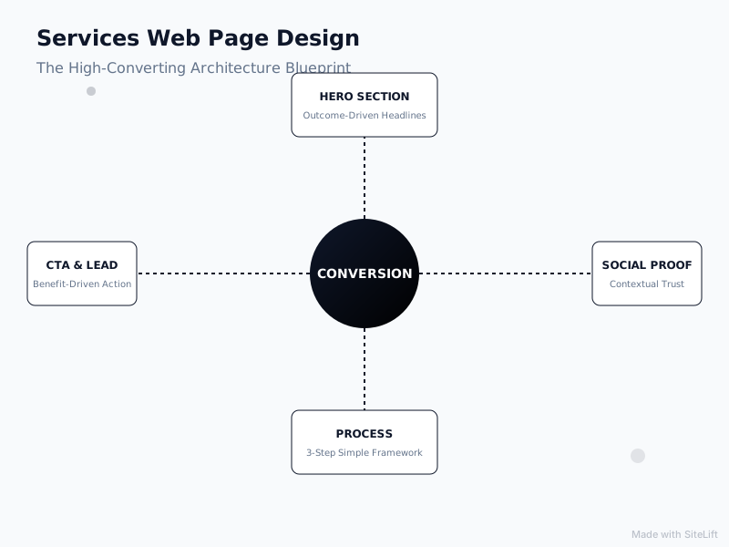
How Do Service Page Trust Signals Eliminate Buyer Skepticism?
Trust is the single most valuable currency in service transactions. When consumers buy physical goods, they can inspect photos, check return policies, and read standardized product specs. When they purchase a service, they are buying a promise.
Integrating deliberate service page trust signals across your layout systematically disarms skepticism and reinforces your credibility.
Infographic by SiteLift
Contextual Proof: Placing Case Studies and Testimonials Where Hesitation Occurs
Most websites bury their testimonials on a dedicated "Testimonials" page or lump them into a generic slider at the bottom of the layout. These isolated carousels are frequently ignored because users recognize them as promotional showcases.
Consumer research published by BrightLocal on local consumer reviews shows that 98% of consumers read online reviews for local businesses before making an inquiry or purchase decision.
To maximize the conversion impact of your social proof, position it contextually:
- Place a quote about your prompt communication directly beneath the section outlining your project timelines.
- Embed a brief, data-backed case study snippet (e.g., "How Company X cut onboarding time by 3 weeks") right next to your service scope breakdown.
- Place micro-testimonials featuring the client's headshot, full name, and company directly adjacent to your booking forms.
For a deeper dive into the behavioural science of credibility markers, read our breakdown of website trust signals for service companies.
Credibility Indicators: Accreditations, Guarantees, and Recognitions
Beyond client testimonials, prospective clients look for objective, third-party validation that verifies your legitimacy:
- Industry Accreditations & Licenses: Prominently display industry-specific regulatory badges, trade certifications, and safety compliance memberships.
- Third-Party Review Badges: Integrate live review widgets from trusted platforms like Google Business Profile, Trustpilot, or Clutch rather than plain unverified text quotes.
- Service Guarantees & Risk Reversals: If you offer an explicit service level agreement (SLA), a satisfaction guarantee, or a milestone-based billing model, highlight it clearly in a dedicated callout box.
| Trust Signal Type | Ideal Page Placement | Primary Conversion Purpose |
|---|---|---|
| Industry Badges & Licenses | Hero Section & Page Footer | Establishes immediate baseline legitimacy |
| Contextual Client Quotes | Alongside Scope & Deliverables | Validates specific execution claims |
| Third-Party Review Ratings | Directly Above Primary Inquiry Form | De-risks the final decision to submit contact info |
| Performance Case Studies | Mid-Page, Post-Problem Analysis | Demonstrates repeatable real-world outcomes |
Transparent Pricing and Timelines: De-Risking the Initial Inquiry
One of the most fiercely debated topics in services web page design is whether to list prices publicly. Many service firms resist publishing numbers because their engagements require custom scoping, or they fear scaring away budget-conscious prospects.
However, withholding all pricing context often backfires. It creates friction, signals that your services might be exorbitantly expensive, and forces buyers to sit through high-pressure sales calls just to learn baseline costs.
If your services require bespoke quotes, you can still provide transparency through:
- "Starting From" Baselines: Giving visitors a clear entry-level floor so unqualified prospects self-select out.
- Average Project Ranges: Showing what a typical mid-tier or enterprise client spends on an average engagement.
- Scope Variables: Transparently listing the factors that cause pricing to move up or down (e.g., square footage, system complexity, turnaround speed).
Addressing pricing openly demonstrates commercial maturity and respect for your buyer’s time.
How Can You Optimize Calls to Action (CTAs) to Turn Browsers into Booked Jobs?
A beautifully structured service page is worthless if it fails to guide the reader into an active inquiry pipeline. Thoughtful service page call to action optimization bridges the gap between passive reading and revenue generation.
Primary vs. Secondary CTAs: Balancing Direct Booking with Lead Nurturing
Not every visitor who lands on your service page is ready to hire you immediately. Service buyers typically fall into two categories:
- High-Intent Buyers: They have an urgent problem, an approved budget, and want to speak with a specialist right now.
- Research-Phase Evaluators: They are defining their requirements, comparing alternatives, and building an internal shortlist.
If your page only offers a heavy commitment CTA—like "Book a 60-Minute Paid Strategy Session"—you lose the research-phase visitors completely. Conversely, if you only offer a soft opt-in like a newsletter, you frustrate high-intent buyers ready to sign.
[ High-Intent Visitor ]  ────────► Primary CTA: "Schedule Your Site Inspection"
                                    (Direct, conversion-focused, scheduled)

[ Evaluator Visitor ]   ────────► Secondary CTA: "Download the Service Scope & Pricing Guide"
                                    (Low-friction, informational, builds pipeline)
According to marketing benchmarks from HubSpot's research on personalized calls to action, personalized or context-relevant calls to action convert 202% better than generic, default CTAs. Tailoring your buttons to the specific service page topic rather than using sitewide defaults generates dramatic lifts in overall form fills.
Actionable Microcopy: Replacing Vague Labels with Benefit-Driven Text
The microcopy inside and around your CTA buttons heavily impacts click-through velocity. Generic labels like "Submit," "Send," or "Click Here" introduce hesitation because they highlight the effort required rather than the value received.
Replace operational commands with outcome-oriented phrases:
- Change "Submit Form" to "Request Your Custom Proposal"
- Change "Contact Us" to "Check Availability for Your Dates"
- Change "Book Consultation" to "Claim Your 20-Minute Strategy Call"
Add subtle anxiety-reducing subtext directly below the button: "No pushy sales calls. We respond within 2 business hours. Your information remains strictly private."
Friction Reduction: Minimizing Form Fields and Offering Real-Time Assistance
Every unnecessary field you add to an inquiry form decreases conversion velocity. Ask yourself: what information do you truly need to conduct a productive initial conversation?
For most service businesses, three or four fields are plenty:
- First & Last Name
- Work Email / Phone Number
- Website URL or Project Location
- A brief dropdown menu specifying their primary challenge
Pro Tip: If high-value leads browse your service pages outside standard business hours, static forms can create a response lag that loses deals. Deploying an AI-powered conversational assistant to qualify leads, answer common scope questions, and let visitors pick an open calendar slot in real time captures high-intent prospects before they bounce to a competitor.
How Do You Upgrade an Existing Service Page Without a Full Website Rebuild?
Many business owners believe fixing an underperforming website requires tearing everything down and spending months building a new site from scratch. In reality, full redesigns are often expensive, slow, and disruptive.
Upgrading your existing services web page design through focused, incremental optimizations almost always delivers a faster, cleaner return on investment. If you want to see how targeted architectural tweaks generate dramatic growth, review these 8 website optimization examples that doubled service leads.
Step 1: Audit Heatmaps & Drop-offs (Identify where users stop scrolling)
               │
               ▼
Step 2: Rewrite Headlines & Subheads (Clarify value proposition in 5 seconds)
               │
               ▼
Step 3: Relocate Social Proof (Move reviews next to friction points)
               │
               ▼
Step 4: Streamline Forms & Mobile UX (Enable tap-to-call & concise forms)
Diagnostic Auditing: Identifying Drop-Offs with Heatmaps and Analytics
Before changing a single line of copy, inspect how visitors currently behave on your service pages. Leverage behavioral analytics tools (like Microsoft Clarity or Hotjar) alongside Google Analytics 4 to establish clear performance baselines:
- Scroll Depth Maps: Where does the typical visitor stop scrolling? If 60% of your visitors drop off before reaching your testimonials, those proof points need to move up.
- Click Maps: Are visitors clicking non-clickable images or missing your primary CTA buttons entirely?
- Form Analytics: Which specific field causes visitors to abandon your booking form?
Incremental Copy and Hierarchy Fixes for Fast Conversion Lifts
Once you identify where users drop off, apply these high-impact adjustments to your live pages:
- Inject the target keyword and core outcome into your H1: Ensure search engines and humans instantly understand the service category.
- Pull quotes out of your footer slider: Embed single-sentence, verified reviews alongside your deliverables section.
- Implement a sticky CTA bar: On long service pages, ensure a subtle header or floating footer button keeps the primary action visible as the user scrolls.
Mobile Experience Tuning: Optimizing for Click-to-Call and Fast Loading
A massive share of service inquiries—particularly for emergency, local, and trade services—originates on mobile devices. A service page that looks beautiful on an ultra-wide desktop monitor can quickly turn into an unusable mess on a smartphone.
To safeguard your mobile conversion rate:
- Ensure all phone numbers are coded with active
tel:links for immediate tap-to-call dialing. - Keep form inputs stacked vertically with large tap targets (minimum 48x48 pixels) to prevent input errors.
- Compress heavy media files to guarantee pages render in under two seconds over mobile cellular connections.
If you are looking to audit your entire inbound client journey, our comprehensive guide to conversion optimisation services walks through how to systematically eliminate funnel leaks.
The Growth Kings Perspective: Why "Pretty" Websites Are Underrated Disasters
I have reviewed hundreds of service company websites over the years, and one recurring pattern stands out: the prettiest websites often make the least money.
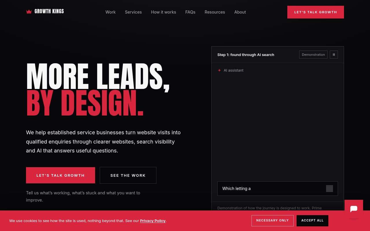
Founders love design agencies that present them with sleek, minimalist canvases featuring subtle off-grey typography, high-fashion layout grids, and artistic stock photography of glass office buildings. It feels elevated. It looks like an art gallery.
The problem? Art galleries are meant for quiet contemplation, not commercial action.
When a homeowner’s basement is flooding, or an enterprise operations manager is losing sleep over a broken supply line, they are not looking for modern art. They want fast answers, verified competence, clear pricing expectations, and an effortless way to book a vetted specialist.
At growth-kings.com, we focus on clarity and trust over unnecessary visual complexity. You rarely need an expensive, months-long website overhaul to scale your inbound inquiries. What you actually need is rigorous page architecture, messaging that speaks directly to client pain points, trust signals placed where hesitation happens, and intelligent automation that captures inquiries when your office is closed.
Treat your service pages like your most disciplined salesperson. Give them the structure, social proof, and clear instructions they need to close the deal.
"Clarity will always outperform cleverness. Design your service pages to solve the client's problem, eliminate their anxiety, and get out of the way of the sale." — growth-kings.com
Frequently Asked Questions About Services Web Page Design
What elements must every service page include to convert visitors?
Every high-converting service page needs six core architectural elements:
- An outcome-driven hero section with a clear H1, subhead, primary CTA, and trust anchor.
- An empathetic problem-agitation section addressing client pain points.
- A transparent deliverables section explaining what the client actually receives.
- A simple 3-step "How It Works" delivery process.
- Contextual social proof (case studies, review snippets, accreditations) placed near decision points.
- A low-friction inquiry form supported by clear, benefit-driven CTA microcopy.
Should I show pricing directly on my service web page?
Yes, in some form. While you may not be able to provide a finalized quote for complex, custom engagements, offering "starting from" baselines, typical project ranges, or clear explanations of cost drivers eliminates buyer anxiety. Pages with transparent pricing frameworks filter out unqualified tire-kickers and build immediate trust with high-intent buyers who want to know if you fit their budget before investing time in a discovery call.
How long should a high-performing service web page be?
The ideal length depends on the complexity and financial risk of your service. Low-cost, routine services (such as standard residential maintenance) convert best on concise, scannable pages focused on speed, pricing, and fast booking. High-ticket B2B consulting, enterprise engineering, or complex medical services require longer, comprehensive pages that thoroughly address scope, risk management, methodologies, and technical compliance. The rule of thumb: make the page long enough to resolve every major purchase objection, but not a single sentence longer.
Where is the best place to put calls to action on a service page?
Calls to action should appear at every logical decision point throughout the page layout. This includes:
- Directly above the fold in the hero section for repeat visitors or high-intent leads.
- Immediately following the "How It Works" or scope breakdown, right after the user understands the service mechanics.
- At the very bottom of the page to capture prospects who read through your entire case study and proof sections.
- Within a persistent, sticky navigation header or mobile footer bar on long-form service pages.
How can I tell if my current service page needs a redesign or just copy optimization?
If your page loads quickly, functions reliably on mobile devices, and sits on a modern, easily editable content management system, you almost certainly do not need a complete redesign. If your bounce rates are high and inquiry volume is low, the issue is usually weak messaging, poor information hierarchy, missing trust signals, or confusing CTAs. Updating your value propositions, reorganizing section flow, and embedding contextual reviews can double your conversion rates at a fraction of the cost of a full site rebuild.
Want this working on your own site?
Tell us what’s working, what’s stuck and what you want to improve. We will reply personally.