9 Homepage Layout Ideas That Turn Service Visitors Into Qualified Enquiries
Discover 9 proven homepage layout ideas for service businesses. Learn how hero placement, trust sections, and AI tools convert traffic into leads.
By Growth Kings. Published , updated . 17 min read.

9 Homepage Layout Ideas That Turn Service Visitors Into Qualified Enquiries
Most website design galleries showcase sleek e-commerce store fronts or minimalist SaaS dashboards. But if you run a B2B consultancy, commercial agency, or specialized advisory firm, those designs won't help you fill your sales pipeline. High-ticket service buyers don't add services to a digital cart; they scrutinize your authority, evaluate risk, and seek proof that you can solve their specific problem.
If you are looking for practical homepage layout ideas engineered to convert cold traffic into high-value sales conversations, you need structures built specifically for professional service delivery.
According to eye-tracking research compiled by the Nielsen Norman Group, visual hierarchy dictates where user attention flows within milliseconds of landing on a page. In fact, foundational studies by Google and Carleton University revealed that web users form a definitive visual opinion about a website within 50 milliseconds (0.05 seconds). Pair that micro-window with research from Gartner, which demonstrates that B2B buyers spend only 17% of their total purchase journey meeting directly with potential suppliers, and the mandate becomes clear: your homepage must do the heavy lifting of establishing trust and qualifying leads long before a prospect ever books a discovery call.
In this guide, we analyze 9 field-tested homepage layout ideas designed specifically for service businesses. Each architecture is evaluated on its ability to capture intent, reduce buyer friction, and filter out low-quality lead inquiries.
What Makes a Service Homepage Layout Convert Visitors into Qualified Enquiries?
The Anatomy of High-Intent B2B Service Traffic
Service buyers arrive at your site carrying operational anxiety. They are dealing with a broken internal process, an underperforming vendor, or a growth ceiling they cannot break through on their own. They aren't browsing for entertainment; they are actively seeking risk mitigation.
An effective service business homepage structure acknowledges this psychology immediately. Rather than burying your primary capabilities under vague taglines, the layout must instantly establish three things above the fold:
- Who you serve (and who you deliberately do not).
- The specific business outcome you guarantee or deliver.
- The friction-free path to start a commercial dialogue.
Evaluation Criteria for This Curated List
To filter out generic design trends, every layout idea featured below was evaluated against four core operational criteria:
- Clear Hero and CTA Placement: Does the above-the-fold architecture immediately direct visitor focus toward a logical action step?
- Progressive Qualification: Does the layout filter out unbudgeted or poor-fit prospects before they clog your calendar?
- Trust Signal Layering: How effectively does the design integrate social proof, case metrics, and authority markers into the scanning flow?
- Conversion Friction: How simple is it for a decision-maker to take the next step without feeling pressured into an aggressive sales pitch?
For a deeper dive into optimizing message placement, explore our guide on homepage content that converts for service businesses.
1. The 'Outcome-First' Value Split Layout
Core Architecture & CTA Placement
The "Outcome-First" layout divides your above-the-fold space into two primary focal points. On the left, a bold, benefit-driven headline details the core business result you unlock for clients, paired immediately with primary and secondary calls to action. On the right, instead of stock images, this layout features a dynamic proof card (such as a live campaign metric, ROI graphic, or short video testimonial).
Immediately below the split hero, the layout transitions into a horizontal bar showcasing verified client logos and key metrics (e.g., "$45M+ Revenue Generated for Clients").
+-------------------------------------------------------------------+
|  [ Headline: Outcome-First ]    | [ Dynamic Proof Card / Video ] |
|  [ Subhead & Target Persona]    | [ Live Metric / ROI Graphic ]  |
|  [ CTA 1: Book Call ] [ CTA 2 ] |                                |
+-------------------------------------------------------------------+
|               [ Client Logos & Metric Ticker ]                     |
+-------------------------------------------------------------------+
Why It Converts Service Visitors
Decision-makers are pressed for time. This layout eliminates guess-work by presenting the commercial transformation right away. By offering dual CTAs—such as "Book a Strategy Call" for high-intent visitors and "Calculate Estimated ROI" for mid-funnel researchers—you capture prospects across varying stages of readiness.
Data from HubSpot shows that personalized calls to action (smart CTAs) convert 202% better than generic default CTAs. Giving visitors a choice based on their immediate intent leverages this exact dynamic.
Best-Fit Service Models
Growth consultancies and marketing agencies.
Commercial logistics and supply chain advisory firms.
Enterprise software implementation partners.
Standout Strength: Instant clarity; cuts straight to business value without fluff.
Main Drawback: Requires strong, validated metric data to execute credibly.
2. The 'Immediate Proof & Credibility Stack' Homepage Layout Idea
Core Architecture & CTA Placement
This layout prioritizes risk elimination above all else. Designed specifically for industries where buyer skepticism is extremely high, the homepage trust section layout is moved directly into the hero zone.
The headline sits alongside top-tier trust verification tags: industry accreditations, five-star review badges from third-party platforms (like Clutch or Google Reviews), and press citations. The primary CTA ("Request an Audit" or "Schedule Consultation") sits atop a shaded container listing key trust guarantees, such as "No Long-Term Contracts" or "SOC-2 Certified."
+-------------------------------------------------------------------+
|  [ Trust Badges / Accreditations / Rating Stars Top-Bar ]         |
|                                                                   |
|  [ Value Headline ]            [ High-Value Lead Capture Form ]   |
|  [ Direct Proof Statement ]    | - Name & Work Email             |
|  [ Bulleted Risk Guarantees ]  | - [ CTA: Request Audit ]        |
+-------------------------------------------------------------------+
Why It Converts Service Visitors
When buyers hire an IT security firm, commercial legal team, or accounting group, their biggest fear isn't cost—it is making a high-stakes mistake. By placing direct authority markers directly where the eye lands, you collapse the evaluation phase and ease anxiety.
Best-Fit Service Models
Managed Service Providers (MSPs) and cybersecurity firms.
Corporate legal practices and financial auditing agencies.
Commercial engineering consultancies.
Standout Strength: Maximizes trust immediately; dramatically reduces bounce rates for cold traffic.
Main Drawback: Risk of visual clutter if badges and proof elements aren't organized carefully.

3. The 'Interactive Concierge / Self-Qualification' Layout
Core Architecture & CTA Placement
Instead of relying on a static hero image or paragraph copy, this layout places an interactive diagnostic tool, project estimator, or conversational AI engine front and center in the secondary hero zone.
The user is greeted with an inviting prompt: "Find out which service package fits your operational bottleneck." The visitor selects their company size, core challenge, and budget parameters through a clean, multi-step widget or guided AI dialog window.
+-------------------------------------------------------------------+
|  [ Clear Value Headline ]                                         |
|  [ Subtitle Explaining the Interactive Diagnostic Tool ]          |
|                                                                   |
|  +-------------------------------------------------------------+  |
|  | STEP 1: Select Your Primary Operational Bottleneck          |  |
|  | [ Option A ]     [ Option B ]     [ Option C ]              |  |
|  +-------------------------------------------------------------+  |
+-------------------------------------------------------------------+
Why It Converts Service Visitors
Traditional contact forms feel like black holes. Interactive self-qualification elements flip the dynamic: they offer immediate value or diagnostic feedback in exchange for information. This setup captures inquiries after-hours, pre-qualifies incoming pipeline based on your exact ideal customer profile (ICP), and routes leads directly to the right specialist.
Pro Tip: If you implement an interactive quiz or AI assistant, limit initial inputs to 3 basic questions before asking for an email address. Asking for detailed contact information too early spikes drop-off rates.
Best-Fit Service Models
Multi-disciplinary service agencies.
Technical operations consultancies.
High-volume B2B service providers with distinct buyer personas.
Standout Strength: Exceptional lead qualification capability; engages interactive buyers effortlessly.
Main Drawback: Higher technical complexity to build and maintain smooth integrations.
4. The 'Problem-Agitation-Solution (PAS)' Narrative Flow
Core Architecture & CTA Placement
This vertical narrative layout takes prospects on an intentional psychological journey as they scroll down the page.
- Hero Section: States the common, frustrating industry baseline.
- Section Two (Agitation): Identifies the hidden costs, missed deadlines, and lost revenue caused by status-quo solutions.
- Section Three (Solution): Introduces your proprietary service framework as the direct solution, complete with embedded mid-page CTAs.
+-------------------------------------------------------------------+
| HERO: [ Highlight the Core Industry Challenge ]                   |
+-------------------------------------------------------------------+
| AGITATION: [ Quantify the Hidden Costs of Inaction & Friction ]  |
+-------------------------------------------------------------------+
| SOLUTION: [ Introduce Proprietary Service System ] -> [ CTA ]    |
+-------------------------------------------------------------------+
Why It Converts Service Visitors
Many service buyers know they have a problem, but they haven't fully quantified the cost of ignoring it. The PAS flow builds urgency. By framing your service as a specific remedy to an ongoing headache, mid-funnel CTAs placed after the agitation phase capture high conversion rates.
Best-Fit Service Models
Turnaround management consultancies.
Specialized executive coaching firms.
Niche operational restructuring services.
Standout Strength: High emotional resonance; creates urgency for complex advisory services.
Main Drawback: Requires exceptional copywriting; can feel overly aggressive if tone is missed.
5. The 'Audience-Segmented Fork' Homepage Layout Idea
Core Architecture & CTA Placement
If your business serves vastly different audiences—such as Enterprise vs. Mid-Market, or Healthcare vs. Financial Services—a single, generic message dilutes your value. The "Audience-Segmented Fork" addresses this immediately below the main value proposition headline.
The layout splits into interactive columns or cards, explicitly inviting visitors to pick their path: "I am an Enterprise CTO" vs. "I am a Growth-Stage Founder." Clicking a path updates the secondary content modularly or routes the visitor to a dedicated, intent-aligned landing page.
+-------------------------------------------------------------------+
| [ Headline: Specialized Solutions for Growing Enterprises ]        |
+-------------------------------------------------------------------+
| SELECT YOUR PATH:                                                 |
| +-------------------------+     +-------------------------------+ |
| | FOR ENTERPRISE LEADERS  |     | FOR MID-MARKET EXECUTIVES     | |
| | - Custom Integrations   |     | - Fast-Track Implementation   | |
| | [ Explore Enterprise ]  |     | [ Explore Mid-Market ]        | |
| +-------------------------+     +-------------------------------+ |
+-------------------------------------------------------------------+
Why It Converts Service Visitors
B2B buyers want to know that you understand their specific regulatory, technical, or financial environment. By offering explicit segmentation on the homepage, you eliminate navigation confusion without overwhelming your main menu.
Best-Fit Service Models
Custom software development firms.
Industry-specific marketing agencies.
Specialized HR and talent acquisition consultancies.
Standout Strength: Delivers tailored relevance for diverse buyer groups.
Main Drawback: Requires dedicated sub-pages or modular sections to maintain the experience downstream.
6. The 'Process Transparency' Framework Layout
Core Architecture & CTA Placement
One of the primary reasons prospective clients delay reaching out is fear of the unknown. The "Process Transparency" layout resolves this by centering the middle of your homepage around a clear 3-to-4-step operational roadmap.
The hero establishes the service proposition, and the next section clearly maps out what happens after someone submits an inquiry:
- Step 1: 15-Minute Discovery Audit (No Pitch).
- Step 2: Tailored Roadmap & Fixed-Fee Proposal.
- Step 3: Rapid 14-Day Onboarding.
+-------------------------------------------------------------------+
| [ Hero Proposition & Initial CTA ]                                |
+-------------------------------------------------------------------+
| OUR 3-STEP COLLABORATION PROCESS                                  |
| [ Step 1: Audit ]  --->  [ Step 2: Roadmap ] ---> [ Step 3: Launch ]|
| (Explains exactly what happens after booking a discovery call)   |
+-------------------------------------------------------------------+
| [ Primary CTA: Start Step 1 Today ]                               |
+-------------------------------------------------------------------+
Why It Converts Service Visitors
High-ticket buyers hate opaque sales cycles and hidden steps. By laying out your delivery framework step-by-step, you demystify working with you and dramatically lower the psychological barrier to submitting an inquiry form.
Best-Fit Service Models
Architecture, construction, and design-build firms.
Complex IT infrastructure migration consultancies.
High-ticket branding and web design agencies (learn more about optimizing these structures in our services web page design layout guide).
Standout Strength: Eliminates anxiety around sales calls; sets clear expectations early.
Main Drawback: Must keep step descriptions concise so the layout doesn't feel dense.
7. The 'Case-Study-First' Evidence Grid Layout
Core Architecture & CTA Placement
Instead of spending sections describing what you do, this layout jumps straight into what you achieved. Below a concise hero banner, the page transitions into a rich grid of outcome-focused transformation cards.
Each card displays a key metric headline (e.g., "How We Reduced Customer Acquisition Cost by 42% for Client X"), a short summary of the challenge, visual before-and-after proof points, and a direct CTA link ("View Full Project Breakdown & System Used").
+-------------------------------------------------------------------+
| [ Minimal Hero: Real Results for Growing Service Businesses ]     |
+-------------------------------------------------------------------+
| CASE STUDY EVIDENCE GRID                                          |
| +----------------------------+   +------------------------------+ |
| | Metric: +312% Pipeline     |   | Metric: $1.2M Saved          | |
| | Client: Logistics Tech Co  |   | Client: SaaS Enterprise      | |
| | [ View Case & System ]     |   | [ View Case & System ]       | |
| +----------------------------+   +------------------------------+ |
+-------------------------------------------------------------------+
Why It Converts Service Visitors
For sophisticated B2B decision-makers, claims mean nothing—evidence is everything. This layout relies entirely on visual proof to sell your capabilities, allowing buyers to see real outcomes for businesses just like theirs.
Best-Fit Service Models
Conversion Rate Optimization (CRO) and growth agencies.
Executive search and headcount scaling firms.
Lean manufacturing and supply chain advisory practices.
Standout Strength: Highly persuasive for ROI-focused buyers; shifts focus away from price.
Main Drawback: Relies heavily on client approval to share concrete metric data publically.
8. The 'Direct Founder / Specialist Authority' Layout
Core Architecture & CTA Placement
In boutique services, clients aren't buying a generic company brand; they are hiring individual expertise. This layout features high-quality, authentic editorial imagery or video of the founder or lead specialists right in the hero section.
Alongside personal introductory copy ("Hi, I'm [Name]. We help enterprise firms fix [Problem]"), the layout highlights personal accreditations, media appearances, published books, or keynote features, paired with a direct CTA to book a peer-to-peer session.
+-------------------------------------------------------------------+
|  [ Authentic Founder / Specialist Photo ]                         |
|  [ Direct Personal Value Message from Lead Partner ]              |
|  [ Recognized In: Publication Logos / Keynote Badges ]            |
|  [ CTA: Book Direct Advisory Session ]                            |
+-------------------------------------------------------------------+
Why It Converts Service Visitors
Personal connection builds trust faster than corporate copy ever can. Showing the human experts behind the service builds rapport and establishes authority instantly. To optimize this approach further, read our analysis on About Us page trust fixes for service businesses.
Best-Fit Service Models
Boutique management consultancies and specialized legal practices.
High-end financial advisors and fractional executive services (e.g., Fractional CFOs).
Niche expert witness and litigation support consultancies.
Standout Strength: Unmatched trust generation for high-stakes human expertise.
Main Drawback: Challenging to scale if the agency relies heavily on a broader team rather than one founder.
9. The 'Comparison Matrix & Friction-Killer' Layout
Core Architecture & CTA Placement
This layout addresses competitive alternatives head-on. Located immediately mid-page, it features a clean feature comparison table contrasting three choices: In-House Hiring vs. Traditional Agencies vs. Your Service Model.
The table highlights speed-to-value, fee structure, risk level, and dedicated accountability. Clear checkmarks accent your firm's advantages, leading directly into a bold, low-friction inquiry section.
+-------------------------------------------------------------------+
| [ Value Proposition Hero & Immediate Lead Offer ]                 |
+-------------------------------------------------------------------+
| COMPARISON MATRIX: EVALUATING YOUR OPTIONS                        |
| Feature            | In-House Hiring | Big Agency | OUR MODEL    |
| Time-to-Execution  | 3-6 Months      | 6 Weeks    | 7 Days [X]   |
| Month-to-Month     | No              | No         | Yes    [X]   |
+-------------------------------------------------------------------+
| [ CTA: Switch to a Flexible Model ]                               |
+-------------------------------------------------------------------+
Why It Converts Service Visitors
Your prospects are already evaluating alternatives, whether that means hiring internally or signing with a traditional agency. By bringing this comparison onto your homepage, you take control of the narrative, framing your service model as the logical, low-risk choice.
Pro Tip: Avoid using unfair or hyperbolic comparisons. Frame the trade-offs honestly. Acknowledging where an in-house hire makes sense builds credibility for your actual strengths.
Best-Fit Service Models
Productized services and retainer-based agencies.
Fractional executive firms (e.g., Fractional CMO/CTO services).
Modern managed service platforms aiming to disrupt legacy agencies. (See our guide on building a service pricing page that converts).
Standout Strength: Directly handles competitive objections and cost concerns.
Main Drawback: Must be updated regularly to stay aligned with current market alternatives.
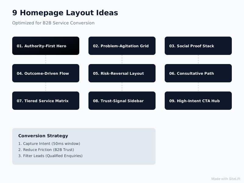
Infographic by SiteLift
Layout Comparison Matrix: Which Structure Fits Your Service Business?
Selecting the right layout depends on your sales cycle length, deal value, and technical implementation capability. Use this comparison table to identify the best fit for your current growth phase:
| Homepage Layout Idea | Typical Sales Cycle | Implementation Complexity | Lead Qualification Strength | Primary Strategic Goal |
|---|---|---|---|---|
| 1. Outcome-First Value Split | 14 – 45 Days | Low / Moderate | Medium | Drive instant commercial conversion. |
| 2. Immediate Proof & Credibility | 30 – 90 Days | Low | High | Overcome buyer skepticism & risk. |
| 3. Interactive Concierge / AI | 7 – 30 Days | Moderate / High | Very High | Automate qualifications & capture 24/7. |
| 4. Problem-Agitation-Solution | 30 – 60 Days | Low | Medium | Create urgency for advisory services. |
| 5. Audience-Segmented Fork | 45 – 120 Days | Moderate | High | Direct multi-persona traffic effectively. |
| 6. Process Transparency | 30 – 90 Days | Low | Medium | Eliminate sales call & project anxiety. |
| 7. Case-Study Evidence Grid | 14 – 60 Days | Moderate | High | Prove ROI with quantified past results. |
| 8. Founder / Specialist Authority | 14 – 45 Days | Low | High | Build rapport & sell expert access. |
| 9. Comparison Matrix | 7 – 30 Days | Low / Moderate | Very High | Disrupt legacy alternatives on value. |
Final Verdict: How to Choose and Iterate Your Homepage Layout
If you are evaluating these homepage layout ideas, avoid the temptation to throw out your current website and start an expensive, month-long custom rebuild. Full site redesigns often introduce unnecessary delays and break existing analytics baselines.
Instead, take a practical, iterative approach:
- Identify your single biggest point of drop-off. Are prospects bouncing immediately because they don't understand your offering? (Deploy Layout 1 or Layout 2). Are they submitting low-quality inquiries that waste your sales team's time? (Integrate the self-qualification elements from Layout 3).
- Layer in trust sections first. Updating your homepage trust layout above the fold often yields quick baseline improvements without requiring structural site updates.
- Refine your calls to action. Replace generic "Contact Us" buttons with clear, intent-aligned action steps like "Schedule a 15-Minute Audit."
At Growth Kings, we help established service businesses update their web presence through practical conversion optimization. Instead of recommending unnecessary full-scale rebuilds, we focus on sharpening clarity, strengthening trust signals, and deploying smart conversion mechanisms—such as after-hours conversational assistants—to convert existing traffic into qualified sales inquiries.
If you want to turn your homepage into a consistent lead generation asset, explore how growth-kings.com can help optimize your current website structure today.
— growth-kings.com
Frequently Asked Questions About Service Homepage Layouts
Where is the most effective place to put a call to action on a service homepage?
The most effective strategy is a multi-tier CTA placement model. Place your primary high-intent action step (e.g., "Book a Discovery Call") clearly above the fold, ideally on the right side of a split hero or anchored beneath your headline. Additionally, embed secondary mid-funnel CTAs immediately following major trust blocks, process explanations, or case study sections so scrolling visitors can take action the moment they are convinced.
How many distinct services should be featured on a single homepage layout?
Rather than detailing every individual service menu item on your homepage, feature 3 to 4 core solution pillars. Grouping your offerings into core strategic categories prevents choice overload, keeps your visual hierarchy clean, and allows visitors to click through to dedicated service sub-pages for deeper technical details.
How does an interactive qualification tool improve enquiry quality compared to a standard contact form?
Standard contact forms collect contact details, but they don't screen out unqualified visitors. An interactive qualification tool or conversational AI assistant guides visitors through targeted screening questions (such as budget, timeline, and primary operational bottlenecks). This gives your sales team context before the first call while deterring low-budget leads who aren't ready to buy.
Can a service business increase enquiries without doing a complete website rebuild?
Yes. In fact, targeted structural improvements usually generate a faster return on investment than a complete website redesign. By redesigning your above-the-fold hero section, adding dynamic social proof blocks, optimizing headline clarity, and introducing a modern qualification workflow, you can significantly boost enquiry conversion rates on your existing website infrastructure.
Want this working on your own site?
Tell us what’s working, what’s stuck and what you want to improve. We will reply personally.