Best Call to Action for Services: 12 Proven Phrases That Turn Browsers Into Enquiries
Discover the best call to action for services: 12 high-converting phrases, placements & microcopy to turn visitors into enquiries.
By Growth Kings. Published . 12 min read.

Best Call to Action for Services: 12 Proven Phrases That Turn Browsers Into Enquiries
If you're hunting for the best call to action for services, forget everything you learned from e-commerce. "Buy Now" doesn't work when someone is choosing a lawyer, plumber, or agency.
Service buyers aren't buying a product. They're taking a risk on you. I evaluated these 12 service business call to action examples on three things: Clarity (does it say what happens next?), Value (why should I click?), and Commitment (how scary is the click?). Here are the phrases that consistently turn nervous browsers into qualified enquiries.
What Makes the Best Call to Action for Services Convert?
Generic buttons like Submit or Contact Us fail for services because they create friction without promising value. No one gets excited to "submit."
Service decisions involve high financial and reputational risk. Your visitor is thinking: Will they hard-sell me? Will they waste my time? Do they even understand my problem?
That's why high converting CTA buttons for services balance intent and friction:
- Low-commitment CTAs (audits, calculators, live chat) win early-stage browsers
- High-commitment CTAs (proposals, strategy sessions) win ready-to-buy visitors
The proof is in the data. HubSpot found in an analysis of over 330,000 CTAs that personalized call-to-action performance data converts 202% better than generic defaults. Context beats cleverness every time.
Pro Tip: Swap first-person hesitation for second-person ownership. "Book My Free Session" often outperforms "Book Your Free Session" because it frames the benefit as already theirs.
1. Book Your Free Strategy Session
This reframes the sales call as consulting. You're not asking for a meeting, you're offering 30 minutes of expert thinking.
- What it is: A high-value, time-boxed consultation offer
- Who it's best for: Agencies, consultants, coaches, enterprise professional services
- Standout strength: Positions you as advisor, not vendor, which justifies higher fees
- Main drawback: Attracts tire-kickers if you don't pre-qualify with 2-3 form questions
- Best placement: Homepage hero, service pages, and LinkedIn landing pages
- Microcopy pairing: No obligation. 30 minutes of actionable strategy.
2. Get an Instant Estimate
Pricing uncertainty kills service enquiries. This CTA promises immediate clarity without a phone call.
- What it is: A gateway to a calculator or 3-step quote form
- Who it's best for: Home services, trades, cleaners, landscapers, maintenance providers
- Standout strength: Satisfies price shoppers instantly instead of losing them to competitors
- Main drawback: You must deliver something instant, even a range, or trust drops fast
- Best placement: Sticky header, hero, and Google Ads landing pages
- Microcopy pairing: Answer 3 questions. See your price range in 60 seconds.

3. Claim Your Free Website & Growth Audit
My favorite for agencies. Instead of saying "trust us," you prove it with a tangible diagnostic.
- What it is: A free, personalized teardown delivered as video or PDF
- Who it's best for: SEO agencies, web designers, marketing consultants, IT providers
- Standout strength: Demonstrates competence before the pitch and creates reciprocity
- Main drawback: Takes real work to fulfill — don't automate it into generic fluff
- Best placement: Blog sidebar, exit-intent popup, and service pages
- Microcopy pairing: Delivered to your inbox within 24 hours. Zero fluff.
4. Speak with a Specialist (Not a Salesperson)
This is pure objection-handling in button form. It directly names the fear of being sold to.
- What it is: A reassurance-led consultation CTA
- Who it's best for: Legal, finance, IT support, engineering, healthcare
- Standout strength: Builds instant trust by promising expertise over pressure
- Main drawback: You actually need specialists available — don't bait-and-switch with SDRs
- Best placement: Pricing pages and complex service pages where anxiety is highest
- Microcopy pairing: Direct access to certified experts.
If you use this one, your website trust signals for service companies underneath the button matter even more — photos, credentials, and reviews seal the promise.
5. Check Your Date Availability
Brilliant because it feels like checking, not committing. No one fears a calendar.
- What it is: A low-friction availability checker
- Who it's best for: Event production, caterers, wedding pros, photographers, seasonal contractors
- Standout strength: Leverages scarcity and makes the next step feel logistical, not salesy
- Main drawback: Useless without a live calendar behind it — a static form kills the magic
- Best placement: Hero section with embedded calendar or chat widget
- Microcopy pairing: June is 80% booked — see open dates.
6. Request a Custom Proposal
When procurement is involved, cuteness doesn't convert. Specificity does.
- What it is: A formal, high-intent enquiry for scoped work
- Who it's best for: B2B managed services, architects, commercial contractors, custom fabrication
- Standout strength: Attracts serious buyers and filters out price-only shoppers
- Main drawback: Too intimidating for early-stage visitors — always pair with a secondary low-commitment CTA
- Best placement: Dedicated landing pages and case studies
- Microcopy pairing: Tailored scopes returned in 2 business days.
Pro Tip: Always run primary vs. secondary CTAs together. Example: Primary = "Request a Custom Proposal", Secondary (text link underneath) = "Just browsing? Download pricing guide." You'll capture both ends of intent.
7. Chat with Us Live
Here's my editorial take: this is the most underrated best call to action for services on this list.
Everyone obsesses over button copy, but I’ve seen more service businesses saved by adding a well-configured chat trigger than by any headline rewrite. Why? Because service questions are messy. Do you serve my area? Do you handle this specific issue? How fast can you start? A static form can't answer that. A conversation can.
- What it is: A real-time or AI-powered conversational entry point
- Who it's best for: Literally all local and professional services, especially after hours
- Standout strength: Resolves objections instantly and captures impulse leads at 11pm
- Main drawback: An unanswered chat is worse than no chat — you need AI backup after hours
- Best placement: Floating widget on every page + in-content trigger after FAQs
- Microcopy pairing: Typical response time: under 60 seconds.
Modern AI assistants now qualify, quote, and book while you sleep, which is why conversational triggers are becoming dynamic CTAs, not just support widgets. On mobile especially, a thumb-friendly chat beats a long form — something I break down in this guide to mobile website optimization for service businesses.
8. See How Much You Could Save
Don't sell the service. Sell the math.
- What it is: An ROI-led CTA linking to a savings calculator
- Who it's best for: Bookkeepers, solar installers, energy auditors, outsourced HR, MSPs
- Standout strength: Shifts conversation from cost to return, ideal for CFO-type buyers
- Main drawback: Requires credible numbers — vague savings claims destroy trust
- Best placement: Homepage mid-page and paid social landing pages
- Microcopy pairing: Most clients save $4,200+/yr. Calculate yours.
9. Start Your 3-Minute Assessment
Quantifying time is a cheat code for website enquiry button best practices. "Contact Us" feels infinite. "3-Minute" feels doable.
- What it is: A quiz-style diagnostic that doubles as lead qualification
- Who it's best for: Compliance consultants, HR outsourcing, wellness clinics, business coaches
- Standout strength: Higher completion rates than static forms because of momentum and self-discovery
- Main drawback: Drop-off spikes if you ask for email before showing value — ask on step 3, not step 1
- Best placement: Service pages and blog posts targeting problem-aware searchers
- Microcopy pairing: Get your personalized score + next steps.
CXL's research on how microcopy and cognitive load affect UX decisions backs this up: small wording tweaks that reduce perceived effort can lift completion significantly.
10. Reserve Your Spot on Our Waiting List
Scarcity works when it's true. For in-demand firms, a waiting list increases desire instead of deterring it.
- What it is: An exclusivity-driven application CTA
- Who it's best for: Boutique agencies, premium designers, specialized contractors
- Standout strength: Flips power dynamic — client chases you, building authority
- Main drawback: Backfires badly if you're not actually busy. Don't fake scarcity.
- Best placement: Homepage hero and About page
- Microcopy pairing: Only 2 onboarding slots open for next month.
11. Download Our Service & Pricing Guide
Not everyone is ready to talk. This captures middle-of-funnel researchers you’d otherwise lose.
- What it is: A gated PDF with packages, process, FAQs, and starting prices
- Who it's best for: Professional services afraid to list rigid prices publicly
- Standout strength: Builds email list for nurture while satisfying price curiosity
- Main drawback: Lower immediate intent — you need a 5-7 email follow-up sequence
- Best placement: Pricing page, sticky footer, and retargeting popups
- Microcopy pairing: See real packages, timelines & starting rates.
12. Let’s Fix Your [Specific Problem]
The most empathetic entry on this list. Swap the bracket for their exact pain.
- What it is: A pain-point-specific CTA tailored to page intent
- Who it's best for: Plumbers ("Let's Fix Your Leak"), SaaS agencies, conversion optimizers, pest control
- Standout strength: Maximizes relevance and Quality Score on paid search landing pages
- Main drawback: Doesn't scale as a site-wide button — you need one version per service page
- Best placement: Dedicated service and location pages
- Microcopy pairing: Same-day response from a licensed pro.
According to Unbounce's conversion benchmark report for landing pages, professional service landing pages average 3.5% to 5.0% conversion, but tightening message match like this plus reducing form fields can double that baseline.
Summary Comparison: Which Best Call to Action for Services Fits Your Funnel?
Don't use all 12. Pick one primary high-intent CTA and one secondary low-friction CTA per page. Match them to buyer readiness:
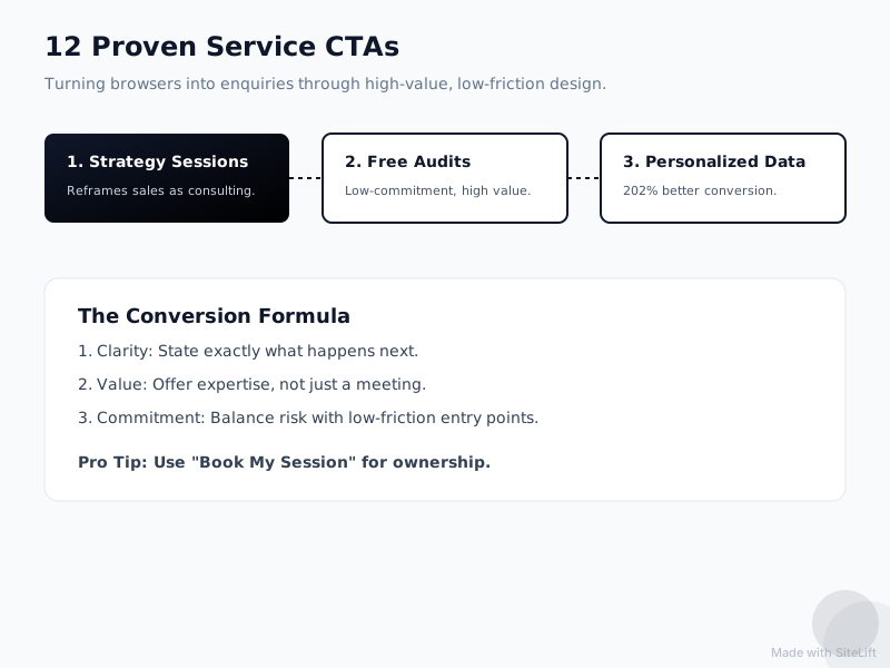
Infographic by SiteLift
| # | CTA Phrase | Intent Stage | Commitment | Typical Best Use |
|---|---|---|---|---|
| 1 | Book Your Free Strategy Session | High intent | High | Agencies, consultants |
| 2 | Get an Instant Estimate | High intent | Low | Home services, trades |
| 3 | Claim Your Free Audit | Middle | Low | Marketing, SEO, IT |
| 4 | Speak with a Specialist | High intent | Medium | Legal, finance, IT |
| 5 | Check Your Date Availability | High intent | Low | Events, weddings |
| 6 | Request a Custom Proposal | Ready-to-buy | High | B2B, architecture |
| 7 | Chat with Us Live | All stages | Very Low | All services, after-hours |
| 8 | See How Much You Could Save | Middle | Low | Solar, bookkeeping |
| 9 | Start Your 3-Minute Assessment | Middle | Low | Compliance, health |
| 10 | Reserve Your Spot | Ready-to-buy | High | Boutique, premium |
| 11 | Download Pricing Guide | Research | Very Low | Professional services |
| 12 | Let's Fix Your [Problem] | High intent | Medium | Paid search pages |
If you only choose two, I’d choose #7 as your always-on safety net and one core offer (#1, #2, or #6) as your money CTA.
Where Should You Place Service CTAs for Maximum Enquiries?
Great copy in the wrong place still fails. Follow these CTA placement for lead generation rules:
1. Above the fold, but after clarity. Nielsen Norman Group eye-tracking shows users spend 57% of their viewing time above the fold, detailed in their research on scrolling and page fold attention. Your hero needs headline + subhead + CTA button in first view. No scrolling to find it.
2. Use sticky and floating triggers. A sticky header with "Get Estimate" + a floating chat bubble captures scrollers and late-night browsers without being pushy. Make buttons high-contrast, with plenty of whitespace.
3. Repeat after value. Add a CTA after every major proof block: after testimonials, after pricing, after FAQs. If you're getting clicks but no enquiries, it's usually message mismatch — this breakdown of high click-through rate but low conversion shows exactly how to fix it.
4. Reduce form friction. Every extra field after name, phone/email, and one qualifying question tanks completion. Send long intake after the first enquiry, not before.
How to Choose the Best Call to Action for Services for Your Site
Forget "Contact Us." If I were redoing a service site tomorrow, I'd do this:
- Homepage hero: Low-friction primary (#2 or #5) + chat secondary (#7)
- Service pages: Specific primary (#12) + nurture secondary (#11)
- Pricing/About: Trust primary (#4) + urgency secondary (#10)
Test one change every two weeks — button copy first, then microcopy, then placement. Don't test color in isolation; contrast for visibility matters, copy for motivation matters more.
Turn More Visits Into Booked Jobs Without a Rebuild
You don't need a new website. You need clearer offers, sharper buttons, and a way to catch leads when you're off the clock.
That's exactly what we do at growth-kings.com — practical website optimization for clarity and trust, plus AI-powered assistants that answer and qualify enquiries 24/7.
Want proof it works? Check these 8 website optimization examples that doubled service enquiries before you change a single button.
— growth-kings.com
FAQ
What is the best call to action for a service business website?
The best call to action for services promises a specific outcome with low risk. "Get an Instant Estimate," "Book Your Free Strategy Session," and "Chat with Us Live" consistently outperform generic buttons because they tell the visitor exactly what happens next and what's in it for them.
Should service businesses use 'Contact Us' as their main CTA button?
No. "Contact Us" is vague and high-friction — it implies work and a potential sales pitch with no clear benefit. Use it in the footer or contact page only. Your main header and hero buttons should be value-led and action-specific.
How many calls to action should be on a service page?
Stick to one primary CTA repeated 2-3 times down the page, plus one secondary low-commitment option like a pricing guide or live chat. More than two distinct offers creates choice paralysis and lowers conversions.
Does changing button color improve CTA conversions?
Contrast helps visibility, but copy drives motivation. A high-contrast button with whitespace will get seen, yet changing "Submit" to "Get My Free Estimate" will move the needle far more than switching from blue to orange. Test copy first.
What microcopy should accompany a service enquiry button?
Add 1 line of reassurance directly under the button: time ("Takes 60 seconds"), risk reversal ("No obligation"), speed ("Response in under 1 hour"), or social proof ("Trusted by 300+ local homeowners"). Keep it to under 12 words.
Want this working on your own site?
Tell us what’s working, what’s stuck and what you want to improve. We will reply personally.