The 21-Point Website Optimization Checklist to Turn Visits Into Qualified Enquiries
Turn website traffic into qualified enquiries with this 21-point website optimization checklist designed specifically for service firms.
By Growth Kings. Published , updated . 17 min read.

The 21-Point Website Optimization Checklist to Turn Visits Into Qualified Enquiries
Driving traffic to your service website costs time, effort, and real budget. Yet, for many established professional service firms, thousands of monthly visitors produce nothing more than a trickle of form fills. If your site gets steady hits but fails to generate a consistent stream of sales conversations, the problem rarely requires a $30,000 full redesign. It usually comes down to small, fixable points of friction across user experience, trust signals, and page speed.
Executing a systematic website optimization checklist allows you to identify where prospective clients drop off and fix those leakages directly. By making targeted improvements to clarity, proof, and mobile responsiveness, you can transform your existing traffic into a predictable pipeline of high-value leads.
This step-by-step guide walks you through a practical 21-point checklist specifically tailored for service-based businesses looking to maximize lead generation.
What Do You Need Before Starting Your Service Website Audit?
Before making changes to your website headers, forms, or layout, you must establish an accurate baseline. Modifying elements without clear analytics tracking makes it impossible to know which adjustments drove real conversion gains.
Essential Analytics and Tracking Tools
Ensure you have full administrative access to your digital diagnostic suite before starting your service website audit checklist:
- Google Analytics 4 (GA4): Confirm custom event tracking is active for form submissions, link clicks, phone number taps, and chat engagements.
- Google Search Console: Verify your site is properly indexed and monitor real-world search queries and click-through rates.
- Behavior Tracking (Hotjar, Microsoft Clarity, or Lucky Orange): Set up heatmaps and session recordings to observe how real users interact with your landing pages.
Defining Your Primary Enquiry Goal
Every page on a professional service site should drive toward one clear business outcome. Trying to convince a visitor to download an ebook, book a discovery call, subscribe to a newsletter, and follow your social channels on the exact same page creates choice paralysis.
- Identify your highest-value conversion target: For most B2B service firms, this is a booked discovery call or a detailed project quote enquiry.
- Define secondary micro-conversions: Reserve lower-friction choices (like reading a case study) strictly as secondary paths for visitors who are not yet ready to buy.
- Gather baseline performance metrics: Note your current numbers over the past 60 to 90 days. Record your total monthly sessions, overall conversion rate (enquiries divided by sessions), bounce rate, and average session duration.
If your preliminary numbers show high traffic with almost zero form fills, review our breakdown on reasons your website isn't converting leads to pinpoint initial structural flaws.
Step 1: Use This Website Optimization Checklist to Clarify Above-the-Fold Content
The top section of your homepage or landing page—visible before a user scrolls—determines whether a visitor stays or leaves. If a user cannot figure out what you do within a few seconds, they will hit the back button and visit a competitor.
Crafting a Clear Value Proposition (Points 1–3)
Point 1: Pass the "5-Second Test"
Your hero section must clearly state three things immediately: what service you provide, who you provide it for, and what primary outcome you deliver. According to research by the Nielsen Norman Group, users often leave web pages within 10 to 20 seconds, making a crystal-clear value proposition in the first 5 seconds essential for retention. Avoid vague corporate fluff like "We deliver innovative solutions for operational synergy." Instead, use direct phrasing like "We help commercial accounting firms automate client onboarding."
Point 2: Ditch Generic Stock Photos for Contextual Media
Generic imagery—like two business professionals shaking hands in an anonymous glass conference room—destroys user trust instantly. Replace stock photography with authentic assets: high-resolution photos of your actual team, clean screenshots of your client portal, or a short, crisp video walkthrough of your service offer.
Point 3: Align Headlines with Primary Pain Points
Your main headline should speak directly to the core problem keeping your ideal client up at night. Rather than focusing purely on your company's history or service categories, lead with the transformation you deliver.
| Weak Headline | Strong, Pain-Point-Driven Headline |
|---|---|
| "Professional IT Managed Services Since 2008" | "Eliminate IT Downtime and Secure Your Firm's Data Without Hiring In-House Tech Staff" |
| "Comprehensive HR Consulting for SMBs" | "Reduce Employee Turnover and Protect Your Business from HR Compliance Penalties" |
Designing the Primary Call to Action (Points 4–5)
Point 4: Position a High-Contrast CTA Button Above the Fold
Your primary Call to Action (CTA) button must stand out visually against your background colors. If your site theme relies heavily on blue tones, use a bold, contrasting color like orange, amber, or bright green for your main action button. Place it front and center in your hero section where the eye naturally rests.
Point 5: Use Action-Oriented, Value-Focused CTA Copy
Standard button labels like "Submit," "Send," or "Learn More" feel like work to the visitor. Upgrade your copy to emphasize the immediate benefit of taking action.
- Instead of: "Submit Enquiry" $\rightarrow$ Use: "Get My Free Website Audit"
- Instead of: "Contact Us" $\rightarrow$ Use: "Book Your 15-Minute Strategy Call"
- Instead of: "Download" $\rightarrow$ Use: "Access the Growth Blueprint"
Step 2: How Do You Build Trust and Credibility Instantly?

Service purchases carry financial and operational risk for buyers. Because prospective clients cannot try out a service before purchasing, your website must eliminate perceived risk through immediate, verifiable trust signals. Implementing a comprehensive trust and clarity website check ensures potential buyers feel confident reaching out.
Placing Social Proof Strategically (Points 6–8)
Point 6: Feature Real Client Testimonials Near Decision Points
Do not hide client feedback on an isolated "Testimonials" page that no one visits. Embed short, punchy client quotes directly alongside your service descriptions and contact forms.
Whenever possible, include:
- The client’s full name and job title
- A headshot photo
- Their company logo
- A specific, measurable outcome (e.g., "They helped us increase our billable hours by 32% within 90 days.")
Point 7: Display Recognizable Client and Partner Logos
A row of client logos placed directly beneath your hero section serves as powerful instant proof. If you serve local businesses, feature well-known regional brands. If you serve enterprises, display recognizable industry badges. This signals to new visitors that established organizations trust your expertise.
Point 8: Structure Case Studies with Problem-Process-Outcome Frameworks
Detailed case studies bridge the gap between promises and proof. Format each case study using a predictable three-part structure:
- The Challenge: The specific operational or financial headache the client faced.
- The Solution: How your firm approached the problem using your unique methodology.
- The Result: The verifiable metrics, time saved, or revenue generated as a direct result.
Displaying Trust Badges and Credentials (Points 9–10)
Point 9: Highlight Industry Accreditations and Security Badges
Showcase official certifications, industry body memberships, awards, and security compliance standards (such as ISO certifications, SOC 2 compliance, or Google Partner status) in your site footer and hero margins.
Point 10: Provide Unmistakable Real-World Contact Details
Service buyers want to know there are real human beings behind a website. Ensure your physical office address, local direct phone number, official corporate registration, and links to active social media profiles (like LinkedIn) are easily visible in your page footer and contact layout.
Step 3: How Do You Streamline the Enquiry Path?
Once a visitor decides your service fits their needs, your job is to make submitting an enquiry as effortless as possible. Excessive form fields, slow communication, or unclear steps generate immediate drop-off. Utilizing a dedicated conversion checklist for enquiry sites helps streamline this process.
Simplifying Contact Forms (Points 11–13)
Point 11: Reduce Form Fields to Essential Qualification Data
Every field you add to a web form increases cognitive effort and lowers completion rates. Research published by HubSpot shows that reducing the number of form fields from 4 to 3 can increase overall conversions by up to 50%. Strip your initial contact forms down to the minimum necessary details to qualify a lead: Name, Business Email, Phone Number, and a brief dropdown selector for their primary need.
Point 12: Use Multi-Step Forms for Complex Inquiries
If your sales team requires detailed project criteria before booking a discovery call, do not present a daunting 12-field form on a single screen. Break the process into a interactive multi-step form:
[ Step 1: Select Your Service ] ---> [ Step 2: Estimated Budget ] ---> [ Step 3: Contact Details ]
Multi-step forms leverage the psychological principle of momentum; once users answer a simple introductory multiple-choice question, they are significantly more likely to complete the remaining contact fields.
Point 13: Embed Friction-Reducing Privacy Assurances
In an era of endless spam calls and inbox clutter, reassure prospective clients that their details are safe. Place a line of small, clear text directly beneath your form's submission button: "We respect your privacy. No spam, ever. Unsubscribe at any time."
Implementing AI Conversational Assistants (Points 14–15)
Point 14: Deploy an AI Conversational Assistant for 24/7 Qualification
High-value prospects often browse service websites outside standard office hours. If a potential client visits your site at 9:00 PM on a Sunday and cannot get answers, they will jump to a competitor.
Deploying an AI-powered conversational assistant allows you to handle inbound questions, collect project specifications, and qualify leads automatically, 24 hours a day. Review our buyer’s checklist for AI assistants to evaluate features before integrating one onto your site.
Point 15: Program Conversational Agents for Instant FAQ Handling
Configure your AI assistant to handle typical top-of-funnel questions instantly:
- "What is your average project timeline?"
- "Do you work with firms in my industry?"
- "How does your pricing structure work?"
By answering preliminary questions in real time, the assistant builds confidence and naturally guides qualified prospects to book a meeting directly on your sales team's calendar.
Step 4: Execute a Technical and Mobile Website Optimization Checklist
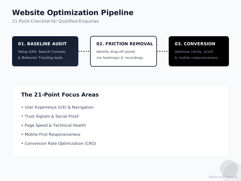
Infographic by SiteLift
Visual appeal and compelling copy cannot save a website that loads slowly or breaks on mobile screens. Technical performance forms the bedrock of search engine rankings and user conversion rates.
Optimizing Page Load Speed (Points 16–17)
Point 16: Compress Media Assets and Adopt WebP Formats
Uncompressed PNG and JPEG images are the most common cause of slow load times on service websites. Convert all site graphics to modern WebP or AVIF formats and compress image sizes below 150 KB.
Page speed directly influences business results. According to performance data published by Portent and documented through tools like Google PageSpeed Insights, a website that loads in 1 second achieves a conversion rate 3 times higher than a site that takes 5 seconds to load.
Point 17: Eliminate Render-Blocking JavaScript and CSS
Heavy scripts, third-party tracking pixels, and custom fonts often stall initial page renders. Work with your technical team to:
- Minify CSS and JavaScript files.
- Defer non-essential scripts until after the primary page content loads.
- Optimize your Core Web Vitals, specifically Largest Contentful Paint (LCP) and Interaction to Next Paint (INP).
Ensuring a Seamless Mobile Experience (Points 18–19)
Point 18: Build Mobile-First Touch Targets and Fluid Layouts
Over half of global website traffic comes from mobile devices. Ensure all links, form fields, and buttons feature large touch targets (at least 48x48 pixels) with ample padding around them to prevent mis-clicks on smaller screens.
Point 19: Simplify Navigation Menus for Handheld Browsing
Desktop navigation bars packed with drop-down links translate poorly to mobile screens. Replace complex desktop navigation with a streamlined hamburger menu that highlights your three main pillars: Services, Case Studies, and Contact/Enquiry.
Step 5: Align Content with Modern SEO Best Practices
A site optimized for conversions needs a steady stream of relevant search traffic to yield results. Applying an seo checklist for service firms ensures prospective buyers find your pages when searching for solutions.
On-Page SEO Checklist for Service Firms (Points 20–21)
Point 20: Target High-Intent, Localized, and Service-Specific Keywords
Generic keywords like "marketing services" carry high competition and low booking intent. Optimize your page titles, meta descriptions, and H1 tags around specific buyer intent:
- Generic: "Accounting Services"
- High-Intent: "Corporate Tax Strategy Services for Manufacturing Companies in Chicago"
Ensure your page title tags stay under 60 characters and meta descriptions sit around 150–155 characters, incorporating clear calls to action. To explore how to make your brand visible across both organic search and AI discovery engines, explore our full guide on Search and AI Visibility services.
Point 21: Build Dedicated Pages for Individual Core Services
A major SEO mistake service businesses make is grouping all solutions onto a single, generic "Our Services" page. Search engines and AI answer engines index dedicated landing pages far more effectively. Build individual, highly focused landing pages for every core service you offer. Each page should contain its own tailored value proposition, proof elements, and primary call to action.
Summary: The 21-Point Website Optimization Checklist
To keep your audit organized, use this printable checklist across your core website pages:
| Category | Item # | Checklist Focus | Goal |
|---|---|---|---|
| Above-the-Fold Clarity | 1 | Pass the 5-Second Test | Clearly state what you do, who you serve, and key results |
| 2 | Contextual Media | Use authentic images/video over generic stock | |
| 3 | Pain-Point Headline | Address the visitor's core business challenge | |
| 4 | High-Contrast CTA | Place a visually distinct primary button above the fold | |
| 5 | Value-Driven Copy | Replace "Submit" with benefit-led action copy | |
| Trust & Proof | 6 | Strategic Testimonials | Position real client feedback near decision points |
| 7 | Client/Partner Logos | Display recognized brand badges prominently | |
| 8 | Structured Case Studies | Detail problem, process, and measurable outcomes | |
| 9 | Industry Credentials | Feature security badges, awards, and accreditations | |
| 10 | Real Contact Info | Show clear physical addresses and direct local phone numbers | |
| Enquiry Path | 11 | Minimal Form Fields | Limit inputs to essential qualification questions |
| 12 | Multi-Step Experience | Divide longer inquiries into interactive steps | |
| 13 | Privacy Microcopy | Provide explicit anti-spam reassurances | |
| 14 | 24/7 AI Lead Capture | Use conversational AI to capture off-hours prospects | |
| 15 | Instant FAQ Handling | Resolve common buyer objections automatically | |
| Technical & Mobile | 16 | Media Compression | Convert images to WebP and keep sizes under 150 KB |
| 17 | Core Web Vitals | Defer render-blocking scripts for sub-2-second speed | |
| 18 | Touch-Friendly Layout | Ensure tap targets meet minimum 48x48px size | |
| 19 | Mobile Navigation | Keep menus clean, intuitive, and thumb-accessible | |
| SEO & Visibility | 20 | High-Intent Metadata | Tailor title tags and meta descriptions to buyer queries |
| 21 | Dedicated Service Pages | Build individual landing pages for every offering |
Why Agency Redesigns Are Overrated (And Audits Win)
In our experience working with established service providers, business owners facing a lead drought often assume their entire website needs to be scrapped. They hire an agency, spend $20,000 to $50,000 on a full redesign, and wait four months for a launch—only to find their lead numbers remain stagnant.
Why does this happen? Because traditional redesigns prioritize visual trends over messaging clarity and conversion mechanics. An aesthetic update rarely fixes a vague headline, a confusing form, or a slow page load speed.
Incremental website optimization beats a total rebuild nearly every time. Fixing your headline, streamlining your form from five fields to three, and speeding up your hero image load time can be completed in an afternoon. These minor adjustments remove immediate points of friction, yielding faster results without technical risk or budget waste.
Pro Tip: Before changing a single word of your copy, review 10 video recordings of real users navigating your site on mobile via Microsoft Clarity or Hotjar. Watching where users pause, rage-click, or abandon your form will show you precisely where your site loses prospective leads.
What Are the Common Pitfalls of Website Optimization?
Even with a detailed checklist, it is easy to stumble during execution. Avoid these three frequent optimization mistakes:
Overcomplicating the User Journey
Offering too many options on a single landing page leads to decision fatigue. If a visitor encounters a call to book a demo, a link to read a blog post, a banner to join a webinar, and a popup for an ebook on the same page, they are likely to take no action at all. Maintain a single, clear path to conversion on key pages.
Ignoring the Post-Submission Experience
The user experience does not end when a prospect hits "Submit." Redirection to a plain white screen that says "Thanks, we received your submission" creates uncertainty. Route users to a dedicated "Thank You" page that sets clear expectations:
- Specify exactly when you will follow up (e.g., "We review all inquiries within 2 business hours.")
- Introduce the team member who will be reaching out.
- Provide a link to a high-value case study to keep them engaged while they wait.
Failing to Periodically Test Live Forms and Workflows
Never assume your forms work perfectly simply because they functioned three months ago. Plugin updates, script errors, or API breaks can quietly break submission fields. Set a recurring monthly calendar reminder to submit a test entry across desktop and mobile devices to verify notifications and analytics tracking work end-to-end.
What Is the Expected Outcome of This 21-Point Checklist?
Applying this checklist transforms your website from a digital brochure into an active lead qualification engine.
Measuring Your Conversion Rate Lift
When you resolve top-of-funnel friction, build immediate trust, and simplify forms, expect measurable performance improvements:
- Lower Bounce Rates: Strong hero headlines keep visitors engaged longer.
- Increased Mobile Leads: Streamlined, thumb-friendly forms remove mobile friction.
- Higher Lead Quality: Clear service descriptions and automated AI qualification screen out poor-fit prospects before they reach your sales team.
| Optimization State | Typical Conversion Rate | Primary Outcome |
|---|---|---|
| Unoptimized Site | < 1.0% | Heavy bounce rates; leads rely purely on personal referrals |
| Basic Optimization | 1.5% – 2.5% | Occasional form fills; inconsistent off-hours capture |
| Fully Audit-Optimized | 3.5% – 6.0%+ | Predictable weekly inbound inquiries; automated 24/7 qualification |
Establishing a Continuous Optimization Cycle
Website optimization is an ongoing habit rather than a one-time project. Implement A/B testing on high-traffic landing pages to continuously refine elements over time:
- Test two variations of your primary headline.
- Compare a single-step form against a multi-step form.
- Test different primary button colors and benefit copy.
By systematically testing and improving one element at a time, you build an enduring competitive advantage that compounds lead generation month after month.
If you prefer to skip the manual labor and want an expert team to systematically audit, optimize, and install automated lead qualification tools on your site, explore how growth-kings.com helps established service businesses build practical, high-converting client pipelines.
— growth-kings.com
FAQ
What is a service website audit checklist?
A service website audit checklist is a step-by-step diagnostic framework used to evaluate a service business's website across messaging clarity, user experience, trust elements, mobile usability, technical speed, and conversion paths. Unlike generic e-commerce checklists focused on shopping carts, it focuses on turning page visits into qualified lead enquiries and discovery bookings.
How often should I run a conversion checklist for enquiry sites?
You should run a comprehensive conversion audit on your website at least once every six months. Additionally, conduct micro-checks whenever you release a new service line, update your primary brand positioning, or launch a major digital marketing strategy.
Why is a trust and clarity website check important for B2B service firms?
B2B service decisions involve high price points and multi-layered buying approvals. Prospective clients cannot "test-drive" a service beforehand, making perceived risk high. A trust and clarity audit ensures your website provides immediate proof of competency, explicit methodology details, and risk-reducing assurances that give buyers confidence to reach out.
Can I perform this website optimization checklist without a full redesign?
Yes. In fact, optimizing your existing website layout is usually far more effective and affordable than a full redesign. Most conversion improvements—such as tweaking headline copy, compressing media files, reordering content blocks, reducing form fields, and adding client proof—can be implemented directly on your current site without tearing down your technical foundation.
Want this working on your own site?
Tell us what’s working, what’s stuck and what you want to improve. We will reply personally.